Select this license type when you are developing an app for iOS, Android, or Windows Phone, and you will be embedding the font file in your mobile application's code.
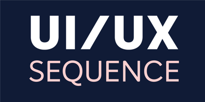
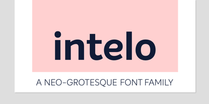
Intelo
by Kastelov
Individual Styles from $25.00
Complete family of 32 fonts: $180.00


Intelo Font Family was
designed by
Galin Kastelov and
published by
Kastelov. Intelo contains
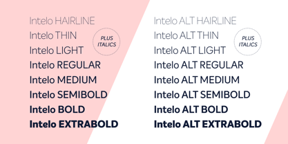
32
styles and family package options.
More about this family
- Aa Glyphs
-
Best ValueFamily Packages
- Individual Styles
- Tech Specs
- Licensing
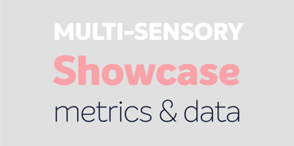
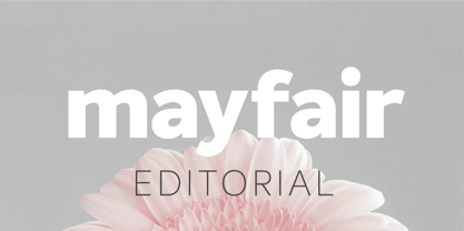
About Intelo Font Family
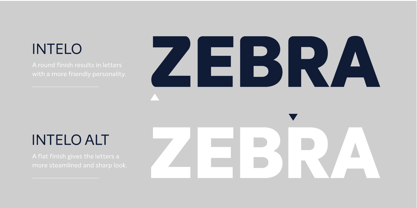
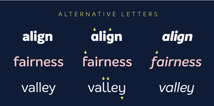
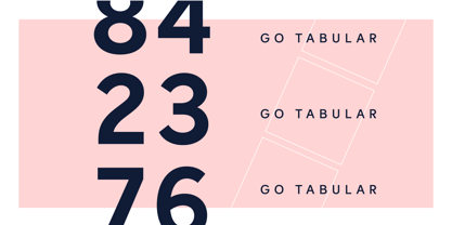
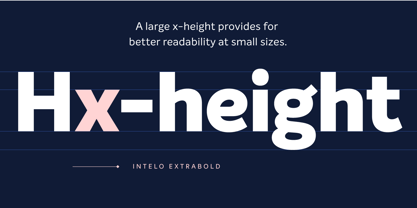
Intelo was created with the single idea of redefining what makes a functional grotesque typeface nowadays. Its large x-height and letterforms with subtle elliptical finish create a distinctive look that can help brands cater to an increasingly design savvy audience. To top it off, Intelo comes in two versions - an attention-grabbing original cut and an additional version with flat endings for a more streamlined effect. The family weights range from thin to extrabold with matching italics making it a versatile choice and perfectly suited for digital applications including web and interaction design as well as printed media such as editorial and corporate materials. When it comes to Opentype features, Intelo is loaded with stylistic alternates, tabular figures, fractions, ligatures, and more. In addition, the font family has an extended language support featuring Western, Eastern and Central European languages. To sum it up, the friendly and inviting letterforms of Intelo came as a solution to the need for more human fonts in our technology-oriented environment.
Designers: Galin Kastelov
Publisher: Kastelov
Foundry: Kastelov
Design Owner: Kastelov
MyFonts debut: Nov 4, 2016
Intelo
About Kastelov
My background is in corporate identity and branding. One approach that I try to follow in the work that I do is my strive for subtlety and simplicity. The great Dieter Rams summed this up much better than I can in his phrase “Less, but better”. The catch of course is that this is easier said than done, and it requires you to be more attentive and strategic about what is essential and what is not. The other concept is that of the 'golden mean', first coined by Aristotle to judge and evaluate character in the people around us, but also applicable to producing any work of consistent value. In people, qualities such as courage, liberality, friendliness, wittiness and modesty are incidentally all attributes that a good typeface should posses. I find this relation both daunting and intriguing, but also a good base for exploring and developing typefaces that are timeless and universally appealing.
Read more
Read less
- Choosing a selection results in a full page refresh.